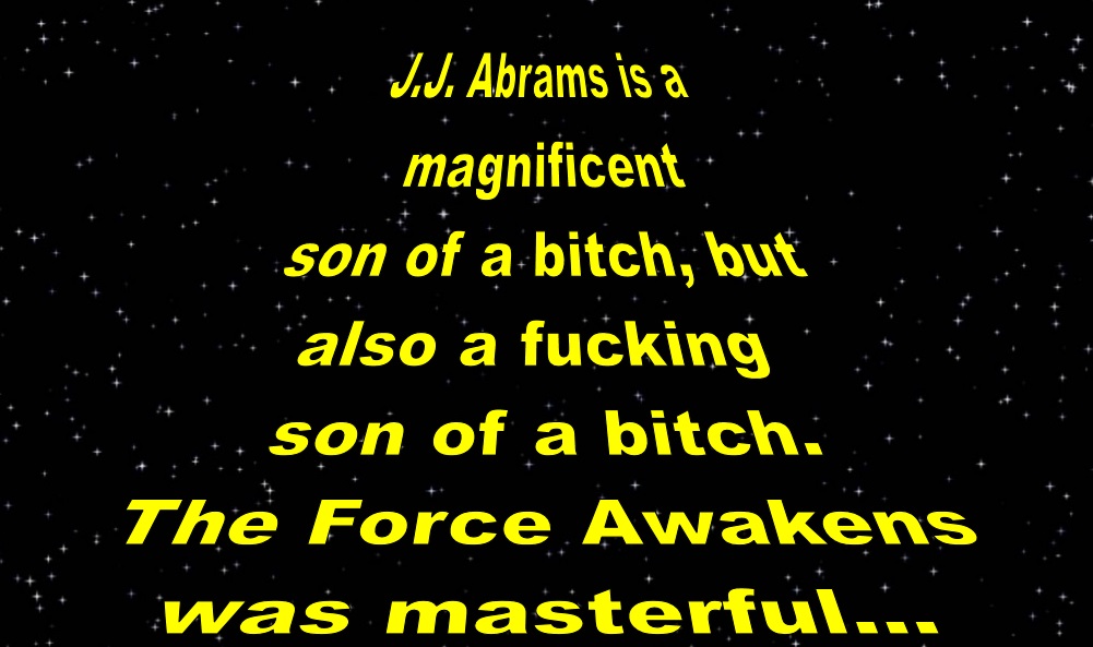
I don’t know why this particular review manifested itself in the manner in which I am sharing it, but I suppose one can take a guess. There are no spoilers in the images below. However, there is a hint at one in the last image. Additionally, what is not mentioned in the review is that I was a bit shocked at the use of like, Arial or Calibri font at the very beginning and for the end credits. Still, I liked the use of the color blue.
Please enjoy.


